Envisioning a new public library for London's Hyde Park
By Justine Testado|
Friday, Apr 28, 2017
Related
In reference to many of London's iconic libraries and the historic prominence of English literature, the Hyde Park Library London was one of archasm's latest international ideas competitions that challenged designers to envision a new 21st-century public library for Hyde Park. At 325 acres, Hyde Park is one of the city's largest parks where people gather to relax and enjoy themselves.
Entrants were encouraged to think of new ways of incorporating digital technology and rethinking the configurations of the library building typology — in ways that would even get non-bookish folks to stay longer. The competition concluded with three prize winners and 10 honorable mentions. Scroll down for a look.
1ST PRIZE: “Hidden Scape” by Seounghyun Cheon, Jihyeon Min (South Korea)
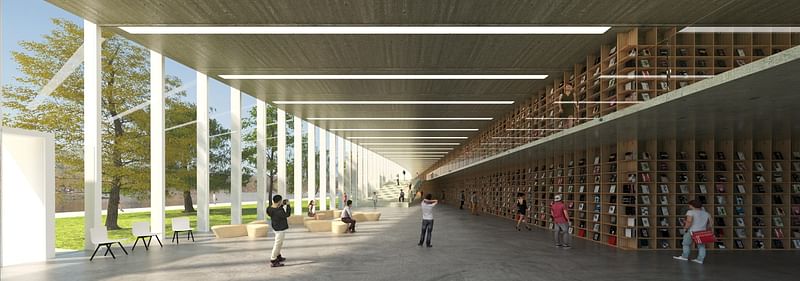
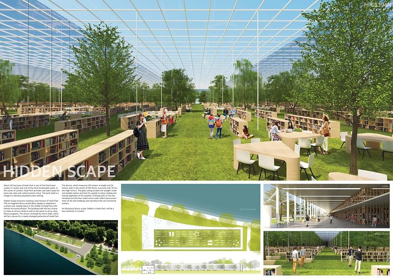
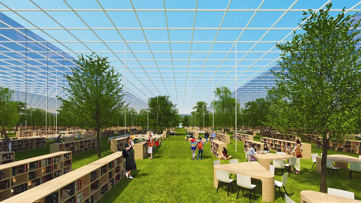
Project description: “Hyde Park is one of the best scenic places in London. It opened to the public in 1637 and had become one of London's most beloved parks. Located in the heart of densely populated urban setting, it is a refuge for people to take a break in their daily routine. Reading books under trees and walking along the lakes are the most comfortable and relaxing experience in Hyde Park. We came up with an idea of creating Hyde Park’s infinite horizon inside the library. The re-imagined library would allow people to experience a whole new kind of reading environment in the middle of Hyde Park with endless horizontal illusion. It is contradictory that people experience the borderless and infinite scenery in clear boundaries with a physical structure.
The site is located between the Serpentine and Rotten Row in the north and the south respectively. Simple box-shaped library building, the perimeters of the site are reflected, was proposed to accommodate an atrium. The building itself will be a frame to make the atrium inside as well as the space to serve other library programs. The atrium, enclosed by mirror walls, will be a canvas for a newly emerged panorama of Hyde Park.
The lobby is an in-between space, between Hyde Park and the atrium. In the lobby, with a height of 7 meters, the public programs of the library such as an information center and retail shops are provided to visitors in an integrated open space. Also, service rooms and facilities located on the basement floor. The four sides of the curved facade with a depth of600mm thin vertical louvers and the long bookshelf corridor make up the building frame itself between the atrium and Hyde Park.
The last destination of the library is the atrium which is the main reading room area. Visitors face a vast horizon withtrees and bookshelves. Existing trees on the site remained, and the four-sided mirror walls reflect the environment of the site endlessly and reproduce the vast horizontal scenery. The scenery of Hyde Park is replicated, but not the same as the scenes outside of the library. The Atrium, which measures 120 meters in length and 24 meters wide in the center of the library, surround with 10 meters high mirrors. Supported by 100mm rectangular white painted steel, the glass ceiling accepts the skylight inside and enables indoor activities. Public activities and the reading room will occupy the atrium beneath the glass ceiling.
The main goal of this project is creating an illusion that produces an infinite, non-physical landscape made by finite and physical materials. The library itself becomes the frame and the connection between Hyde Park and hidden landscape. The boundaries of the building exist but the appeared phenomenon is boundless. In a virtual imaginary landscape space, people explore the world of knowledge without limit.
An illusionary library-scape, hidden in Hyde Park, will be a new landmark in London.”
2ND PRIZE: “Libre airy” by Agata Balikowska (Poland)
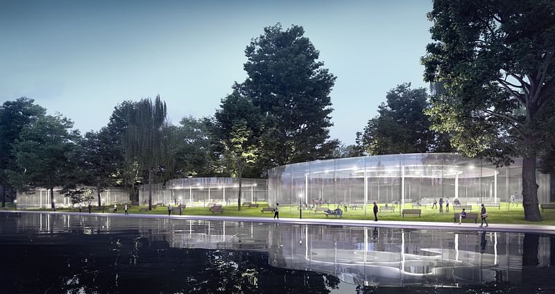
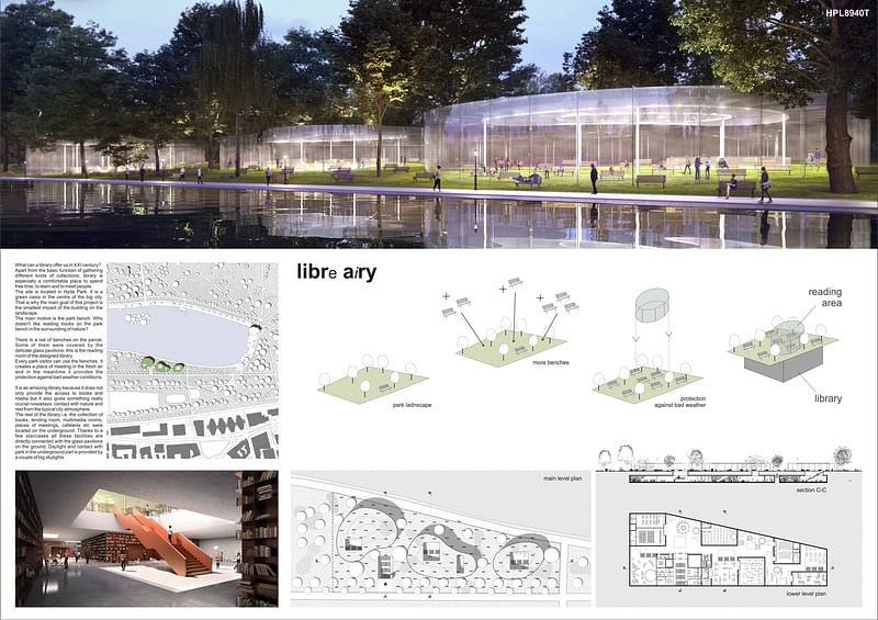
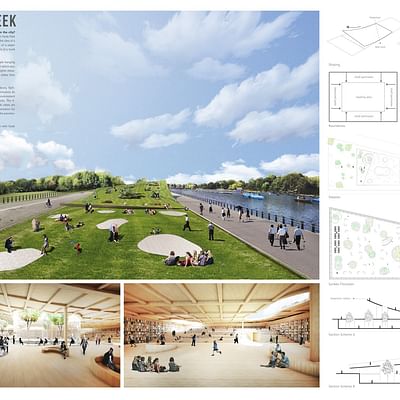
Project description: “‘Libre airy’ project presents a library for a modern reader who lives in a big city.What is more, the aspect of the park, where the building was appointed, was also very important for me.Hyde Park is a royal park in the centre of London and it functions as the green resting area on the contrary to the strongly urbanised city. Placing a building in such surroundings seemed to be inappropriate and against the idea of this area.I started to think how architecture can make this place more lively and how to allow its users to get closer to nature.
The first thing that comes to mind when one does not wish to interfere with the surroundings is to locate the whole facility underground. However, I wanted the library to be a bright, inviting place, full of sunlight, so I rejected this idea. Besides, who goes to park to sit hidden from the world? But still, there are some parts of the library that don't need to be lit by sun. Meanwhile I was thinking about the pleasure of just sitting on the park bench, surrounded by nature and losing yourself in the book.
One of the biggest sources of inspiration was the picture of the benches in Hyde Park. In order to be persistent with the sense they give I made the decision to keep such a bench design for the library visitors. That is why I decided about a grid of benches on the parcel. Some of them were covered by the delicate glass pavilions - this is the reading room of the designed library.Every park visitor can use them. It creates a place of meeting in the fresh air and in the meantime it provides the protection against bad weather conditions.
The remaining facilities such as lending room, rooms with multimedia, places of meetings and cafes are situated under the ground. In order to walk to the other part you can use a couple of staircases. Additionally, sunlight reaches this area through several skylights.
The scheme of use is simple: You go underground where you encounter a bit of the mystery and you choose a book or any file that is interesting to you. Then you go upstairs where you can sit on the bench surrounded by the green landscape and other people. There are three pavilions on the site, so that everyone could use them in their own way: one is for calm reading, while in another you can meet other people and discuss, share ideas, or just spend time together.
The construction of pavilions is very delicate and almost entirely made with glass.Both, pillars and ribs are out of this material. Downstairs, the rawness of concrete and the savor of copper highlight that this part of building is under the ground. It is an amazing library because it does not only provide the access to books and media but it also gives something really crucial nowadays: contact with nature and rest from the typical city atmosphere.”
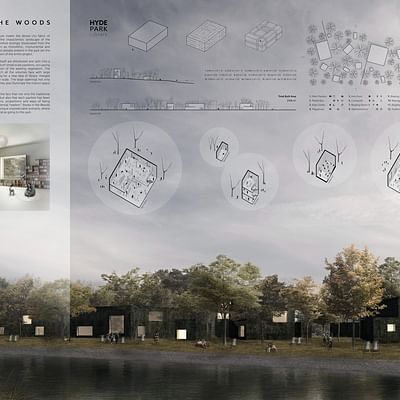
3RD PRIZE: “Hide Park Library: Essence of Reading” by Miriana Kostova, Bernd Bartoz Jan Wroblewski, Daniel Lechler (Germany)

Project description: “Our Design suggests a new form of urban typology, that encourages passersby to read and to pause, whilst integrating into its setting and acknowledging the existing functions of its environment. We started our design process by forging a list of our favorite reading situations, positions and atmospheres. Through this we wanted to get a first handle on the complex program. As in our opinion, to the root of every successful design lies in the understanding of its main purpose and in that the knowledge of the needs and desires of its users. By cross examining our list we narrowed down our favorites and so an emotional construct was formed.
Oddly enough the term "Park" did not make the final selection and the term library was not mentioned once on our long list. This left us with the revelation, that we had to create a new typology, one that would meet the constrains of this competition and our emotional construct. So we set out to dissect the formula, that makes up a library, to find the essentials that we would need to incorporate in our design. The second building block to our approach.
Obviously one of these essential assets would be providing reading material and other media of many sorts. Inspiring people to read is an ability not all libraries possess but one that they should strive for. Connecting people with similar interests is in our op inion one of the most important functions of a library but it is also one that often gets neglected in most typical library typologies.
Its specific attributes make the premises a perfect place for leisure activities for the inarguably stressed and relaxation-searching inhabitants of this super dense city. In such making the Hyde Park in general an important station in the city ́s infrastructure. In consequence it feels right to create an open pub lic ground, that doesn't reduce park-space with large structures. The structures are designed as invisible shelters - the so called ‘Hideouts’ .
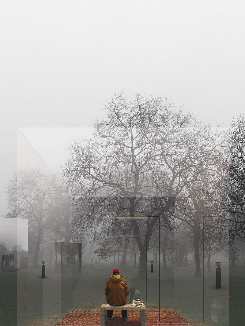
The Hideouts are temperature-regulated weather shelters, planted along the park-side in 3 different sizes, giving the user an unconfined 360° look of the park environment from the inside out. From the outside the facades are mirrored, reflecting the surrounding park elements, thus integrating the box-shaped elements into the landscape, almost to the point of vanishing. This allows the user to disappear and to have undisturbed privacy in an otherwise crowded City. The act of reading is a private one that encloses the reader in his own space, but should not isolate him from the outside.
To the unobservant visitor the only visible elements are dark shiny pillars distributed in the area like path -stones. These ‘Steady Librarians‘ represent the essential infrastructure of our library.
Each ‘Steady Librarian‘ provides several functions like orientation, connection, energy supply and serve as a connector between the community members. These functions are essential for a progressive park-library. The library gives visitors everything they need to satisfy both their reading and their park needs. It offers the flexibility of a park visit but enabling reading in different constellations and weather conditions.
Either alone in the single hideout, as up to 5 individuals next to each other in the medium hideout or in a group, listening to audiobooks and discussing books in the large hideout. If the weather says that there is no need to hide inside, we also say that there isn't. The site's area is still defined as park-space allowing for all regular park activities to happen around the intervention while still benefiting from the ‘Hide Park's‘ infrastructure. We believe that our idea can create a benefit for the culture of reading as well as for the public space in a growingly dense city.
She stopped for just a brief second, taking a deep breath and holding it involuntarily, before finally closing the door behind her completely. The last beam of golden light cuts through the foggy air as the mirrored door falls in place and completes the reflecting surface of the Cube which now again seems to the eye like nothing more but a mirage in the wet and mossy air. Blink and you w ill need to focus to find again the edges that will give away its location by just a trick of the light.
As she slips inside the box and quickly sits herself down on the wooden bench, she looks up and immediately needs to reinsure herself: "Nobody can see you, relax..." She struggles for a couple of seconds to give way to the idea, that it is not her that is on display, but the world around her. ”
Don't forget about the Honorable Mentions in the gallery below!
All images courtesy of archasm.



Share
0 Comments
Comment as :