Eleven designers distinguished in AIA 2017 Small Project Awards
By Justine Testado|
Tuesday, Jun 27, 2017
Related
No matter the limits of size, scope, and budget, architecture at any scale is capable of creating a positive impact. In this spirit, the AIA established the annual Small Project Awards, which recognize practitioners for their high-quality small-project designs. Most recently, the AIA announced 11 winning projects across the U.S. for the 2017 Small Project Awards.
Winners were announced in three categories. Have a look at them below!
Category 1 winners - small project construction, object, work of environmental art or architectural design element up to $150,000 in construction cost.
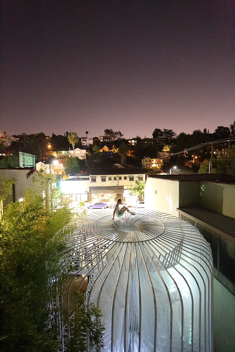
La Cage aux Folles; Los Angeles by Warren Techentin Architecture
Project summary: “Installed in the courtyard gallery of Materials & Applications, this project is an experimental bent steel tube structure that explores the craft of pipe bending, joining form, computational procedures, and fabrication processes into a complex structure that assumes various postures and porosities through looping and layering...Its engagement with the street provided a space for both unscripted use and curated performances. La Cage aux Folles has become a social condenser for the neighborhood and host to many activities during its run...”
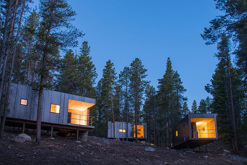
Colorado Outward Bound Micro Cabins; Leadville, Colorado by University of Colorado, College of Architecture and Planning, Colorado Building Workshop
Project summary: “Located in a lodgepole forest 10,000 feet above sea level, these 21 unique cabins are an exploration in micro housing and prefabrication. The initial 14 cabins were designed as seasonal housing for temporary staff. To satisfy lodging and storage, the cabins were conceived as two elements: ‘box’ and ‘frame.’ The ‘frame’ acts as storage for the educator’s gear while also housing the ‘box.’ The second set of seven cabins were designed as year-round housing for permanent staff. The initial concept was reduced to just the ‘box’ through the implementation of structurally insulated panels. Cedar clad porches are carved from the ‘box’ creating private spaces. The hot-rolled steel rainscreen blends with the trees, minimizing visual impact. Prefabricated birch plywood brings warmth to the interiors and connects to the surrounding environment. Each set of cabins was completed in three weeks of on-site construction by 28 graduate students.”
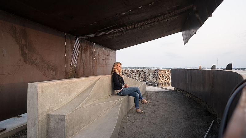
Sunset Pavilion; Firestone, Colorado by Tomecek Studio Architecture
Project summary: “Standing atop and overlooking the park entry—framing panoramic views of the Rocky Mountains—the Sunset Pavilion marks the intersection of multiple paths along a regional trail system. Along with eight additional structures, the pavilion celebrates the simplicity of construction of natural materials. The dramatic prefabricated steel structure cantilevers from grade, shielding visitors from the harsh Colorado sun. Acting as a lens, the pavilion's details emphasize the phenomenal qualities of the sun's path. Perforations along the overhead plane track the sun's movement during the autumnal and vernal equinox...”
Category 2 winners - small project construction, up to $1,500,000 in construction cost.
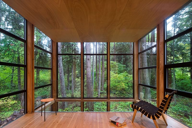
Lightbox; Point Roberts, Washington by Bohlin Cywinski Jackson
Project summary: “Designed as a home and studio for a photographer and his young family, this project is located on a densely forested site on a peninsula that extends south from British Columbia across the border to Point Roberts. A south-facing two-story glass cage for living captures the sun and view...To the north, stairs are contained in a thin, black-stained wooden box with narrow apertures. The home was made decidedly modest, in size and means, with a building skin utilizing simple materials in a straightforward yet innovative configuration. The result is a structure crafted from affordable and common materials, such as exposed wood beams that form the structural frame and directly support a prefabricated aluminum window system of standard glazing units, uniformly sized to reduce the complexity and overall cost.”
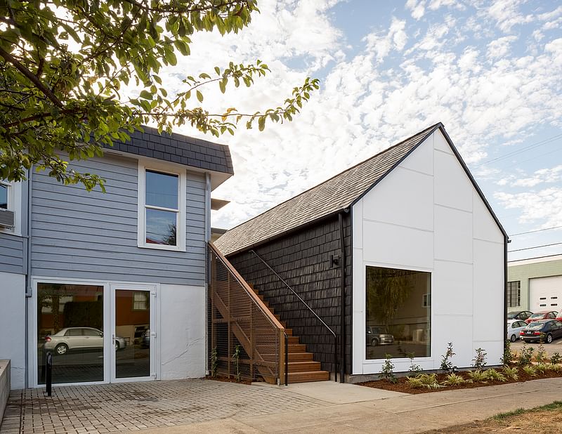
Laura's Place; Portland, Oregon by ARCHITECTURE BUILDING CULTURE
Project summary: “Laura’s Place is a supportive transitional housing facility for pregnant or parenting women who have graduated from an in-patient treatment facility. It offers mothers who have successfully completed their treatment programs a communal home where they can take their next step in the recovery process. Laura’s Place serves an average of 16 women and 16 children every year. The fundamental role of this expansion project was one of reflecting, supporting, and transforming the cultural context of the residents. This was done in a number of ways, from the overall site planning to the design of the new transitional housing units. The emphasis was to create a safe, supportive, and propelling transitional home for the mothers and their children. Critical to the project’s success was the collaborative effort, in part pro bono, by the entire project team and project partners.
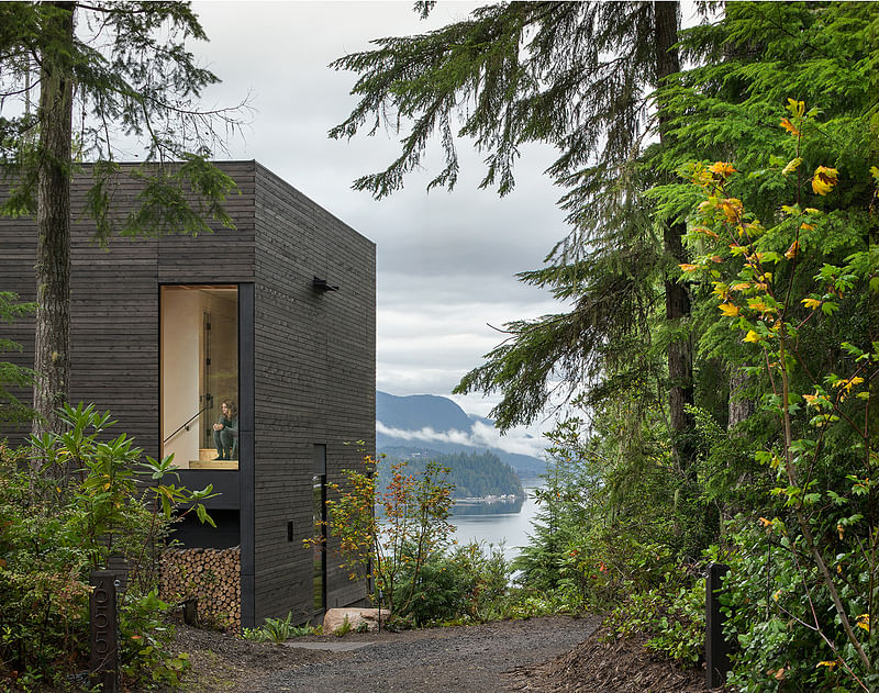
Little House; Seabeck, Washington by mw|works
Project summary: “The project is nestled into a lush second-growth forest on a north-facing bluff overlooking Hood Canal. Built over an existing foundation, the new building is just over 20 foot square. Early discussions focused on a compact, modern structure that was simple and efficient. Visitors approach the site from the south, where a thin canopy marks the entry and frames views of the canal. The more transparent north and west elevations pull the landscape and distant view into the space. Oxidized black cedar and blackened cement infill panels clad the exterior while lightly painted panels and soft pine plywood warm and brighten the interior. On a sunny western corner, a large patio reaches into the landscape—a jumping off point to trails wandering down to the water’s edge...”
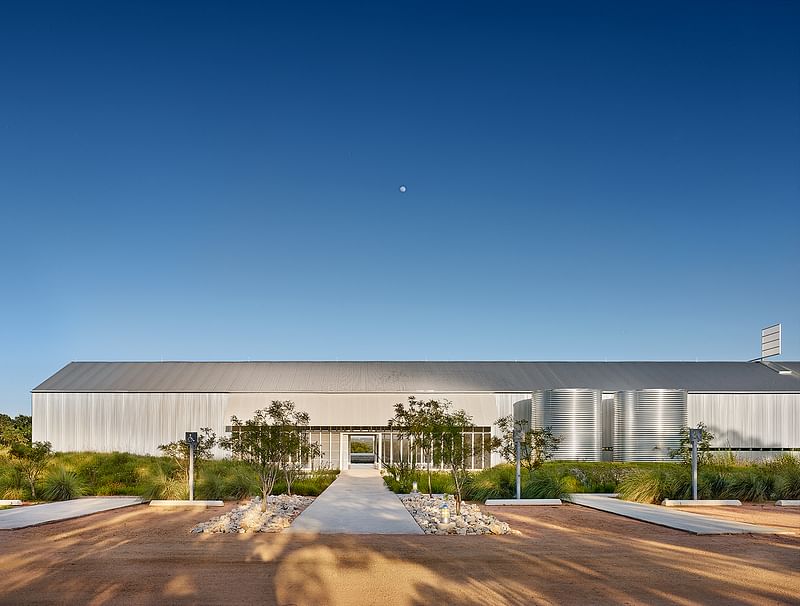
Prospect House; Dripping Springs, Texas by Max Levy Architect
Project summary: “Prospect House is a wedding and event space standing in a twenty-acre field of rolling native prairie. It can accommodate celebrations in numerous configurations indoors, outdoors, and on a huge screened-in porch. Above the main hall is a large wind vane. Its mast extends down into the room and supports a 12-foot diameter ring that can be decorated. The ring turns with the breezes, connecting festivities inside with the world outside. This is modernism reflecting an old-fashioned approach: boards, white paint, and corrugated sheet metal, generously open to almost any function, reframing peoples’ awareness of simple things.”
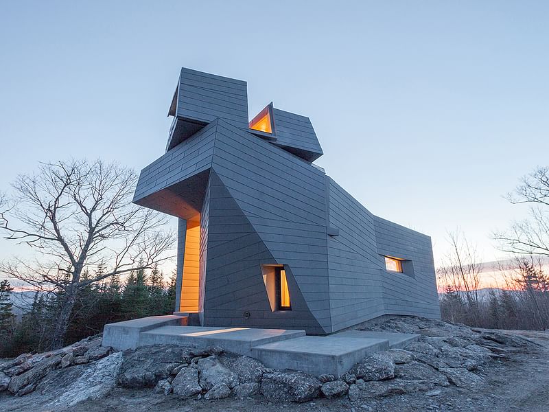
Gemma Observatory; New Hampshire by Anmahian Winton Architects
Project summary: “This private astronomical observatory is located in the mountains of central New Hampshire on a site characterized by gray granite outcroppings. Gemma’s siting, form, and materials are rooted in the practical requirements of minimizing building movement and dissipating heat gain, and in symbolic relationships to both celestial and environmental landmarks. The design rejects a traditional dome in favor of a synthesized architectural form, providing more usable space and emphasizing the observatory’s aesthetic relationship to its stark geographic context. Patterned zinc cladding integrates the site’s irregular topography with the building’s geometry... A helical stair leads from the cantilevered entry canopy to a fissure in the cladding that opens onto the exterior observation deck. Continuing, it arrives at the primary viewing platform inside the faceted turret, whose corner window frames Polaris when locked in the southern cardinal position.”
Category 3 winners - small project construction, object, work of environmental art or architectural design under 5,000 square feet
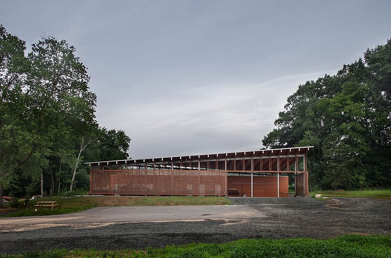
Funny Girl Farm Produce Barn; Durham, North Carolina by Szostak Design, Inc.
Project summary: “Designed as an open-work shed for produce handling, this 4,300-sq-ft barn reflects its agrarian function in its economy of form and materials. The barn shelters a large open workspace and equipment storage area, flanked by a linear bar of enclosed utility spaces. A limited palette of wood and steel articulates the barn’s clearly defined plan. These materials were chosen for durability, to withstand the elements and heavy use. The enclosing screen walls and sloping roof are designed to be responsive to site and climate, and to provide shelter from sun and water while also harnessing wind to provide ventilation. Designed with refined materials and architectural detailing, the shed’s simple structure plainly represents its utilitarian function.”
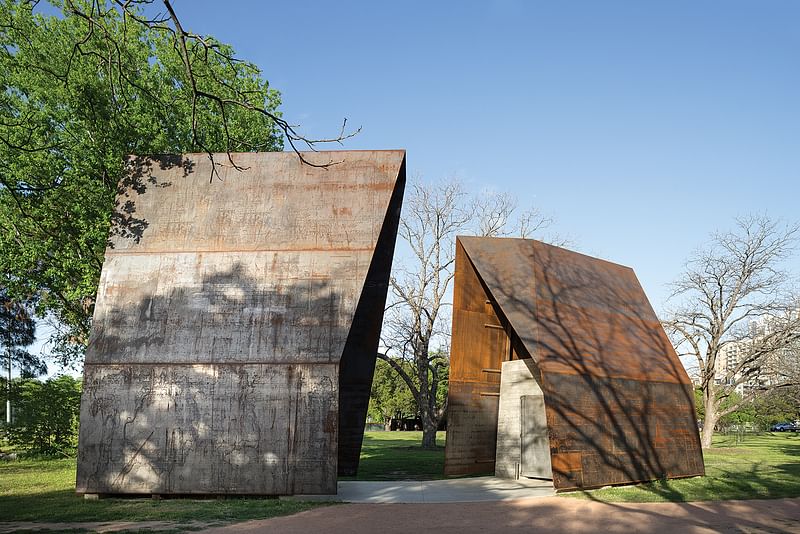
Lady Bird Loo; Austin, Texas by Mell Lawrence Architects
Project summary: “The Lady Bird Loo is located near downtown Austin, in a stretch of hike-and-bike trails paralleling the river that bisects the city. The clients needed two single restrooms, low maintenance and vandal-resistant with great ventilation and a sense of safety for the occupant. The design team wanted spirited shelters scaled to the well treed riverside park space, with each having its own personality. The interiors are safe and airy with great light and views of trees and the sky. Requiring no special finishes or maintenance, the project is built entirely of steel and concrete left raw and unfinished. Changing sunlight animates the whole experience; it amplifies details and narrow edges, re-emphasizes the faceted forms, darts light-slivers through intentional gaps between material, and creates useful shade and fun shadow patterns.”
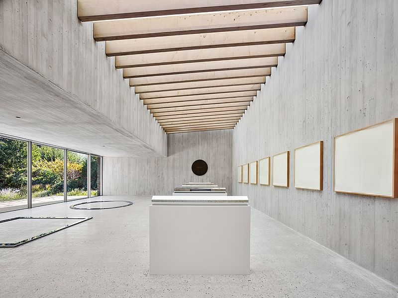
De Maria Pavilion; Bridgehampton, New York by Gluckman Tang Architects
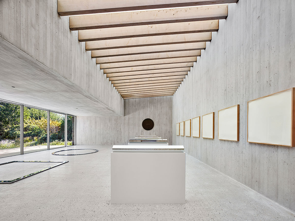
Project summary: “The De Maria Pavilion is part of an informal art walk that links several contemporary sculptures on an estate. Set within a walled 1920s ‘kitchen garden,’ the design inverts the typical formal garden by reintroducing indigenous plantings: cedars, bayberry, white oaks and grasses. The board-formed, concrete interior frames works by Walter De Maria, day-lit by a large skylight and window-wall. Light levels are modulated by light-diffusing glazing and motorized shades mounted above Alaskan Yellow Cedar rafters. The facades of the pavilion reference the surrounding wall and dark granite of Large Grey Sphere, a 32-ton outdoor sculpture. Composed of 24-inch bricks, the east and west faces are set in a random bond pattern with alternating courses corbeled to create emphatic horizontal shadow lines. At the north and south, the brick is split and set in a header-only bond, creating a coarse texture that is a counterpoint to the polished surfaces of the art within.”
The 2017 jury: Jean Dufresne, AIA (Chair), Space Architects + Planners; Richard Fernau, FAIA, Fernau + Hartman; Joyce Hwang, AIA, Ants of the Prairie; Jack Travis, FAIA, Jack Travis FAIA Architect; and Kulapat Yantrasast, wHY.
Photos courtesy of the AIA.

RELATED NEWS Nine architects win big in the AIA 2016 Small Project Awards

RELATED NEWS A closer look at goCstudio's floating wa_sauna, a 2016 AIA Small Project awardee


Share
0 Comments
Comment as :