Dorte Mandrup Arkitekter to design new culture house and library in Karlskrona
By Justine Testado|
Friday, Apr 5, 2019
Related
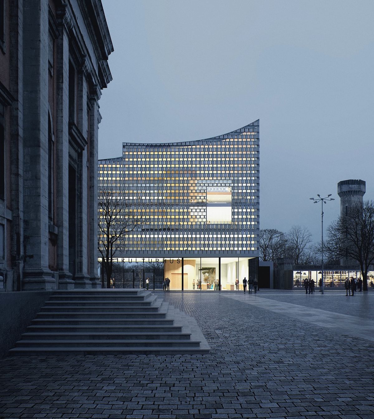
After facing stiff competition from firms like Snøhetta and Wingårdhs Arkitektkontor, the team led by Danish practice Dorte Mandrup Arkitekter ultimately won the commission to design a new culture house and library in the Swedish city of Karlskrona, where many of its central parts have been designated as a UNESCO World Heritage Site.
“The task demands that we act with humility and respect for the existing and at the same time add a new character and identity to the place. This is our preferred way of working, and projects like this is what makes working as an architect meaningful,” architect Dorte Mandrup explains. The Danish firm collaborated with Marianne Levinsen Landskab (landscape architect) and Torbjörn Nilsson (library consultant) in the competition.
Dorte Mandrup Arkitekter shared more details about their design below.
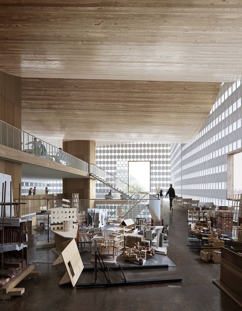
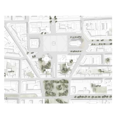
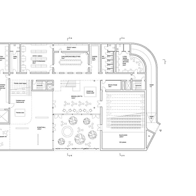
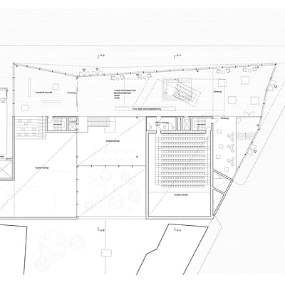
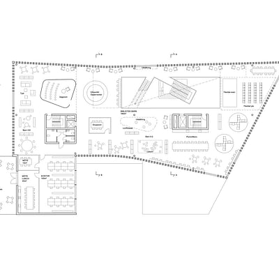
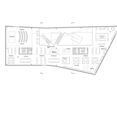
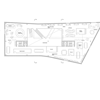
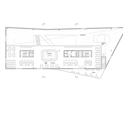
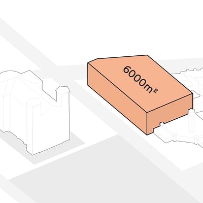
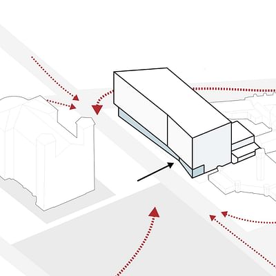
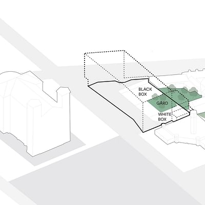
Located at the corner of Karlskrona's ”Stortorget” central square, the project complements its richly historic surroundings. At 6,000m2, it will comprise of a library and a multi-functional room for various cultural activities, like dance and music performances and art exhibitions. Visitors will also be able to access a theater hall, an art hall, tourist information, a maker space, study space, and cafe.
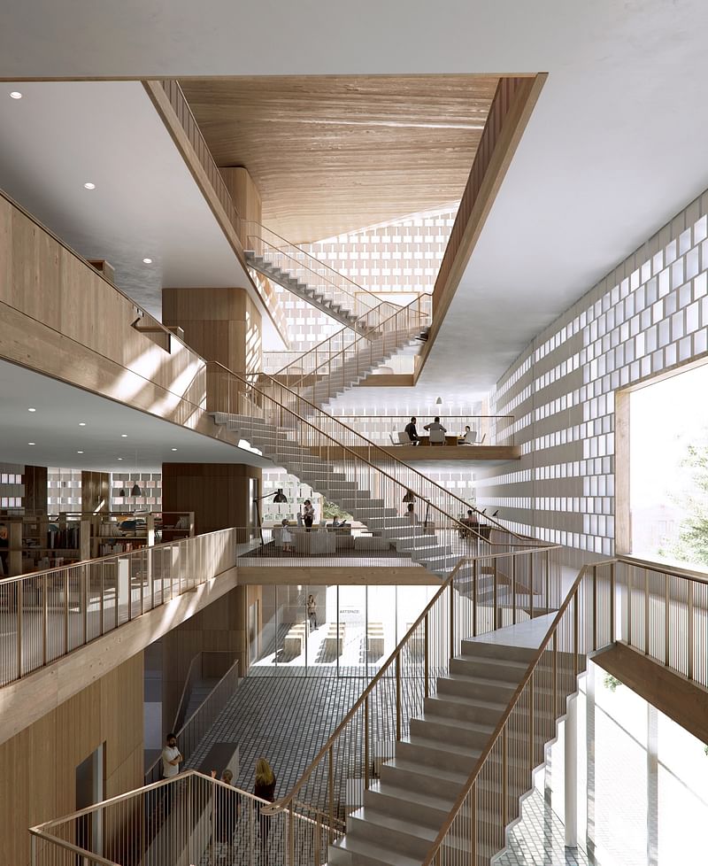
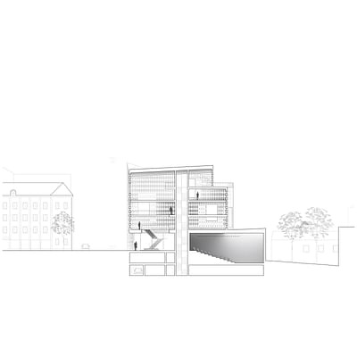
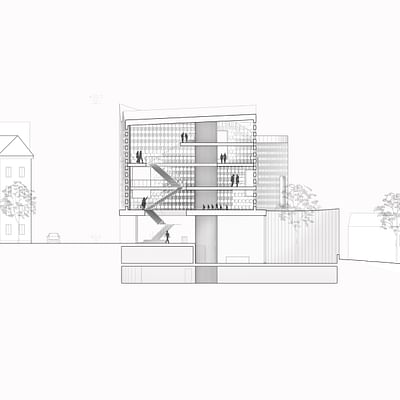
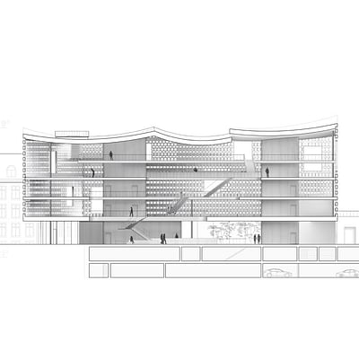
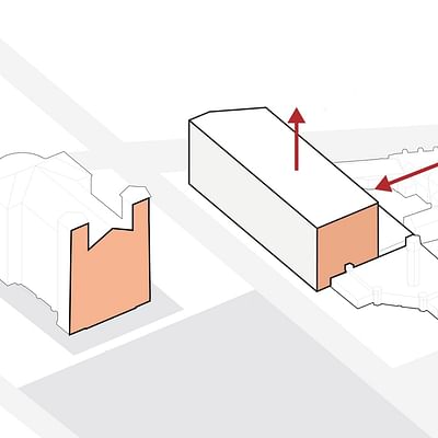
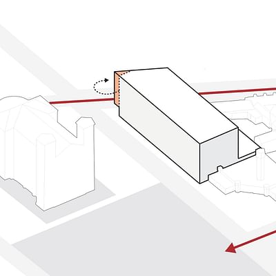
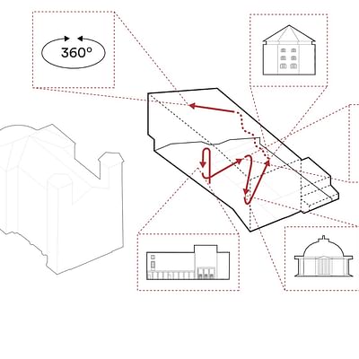
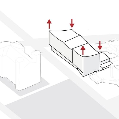
“On the outside, the architects interpret the three-part façade division of the baroque and thus scale down the building's length,” the design team describes. The building's interior has a large, sculptural staircase that connects the building's levels, including a new rooftop viewing platform above the culture house.
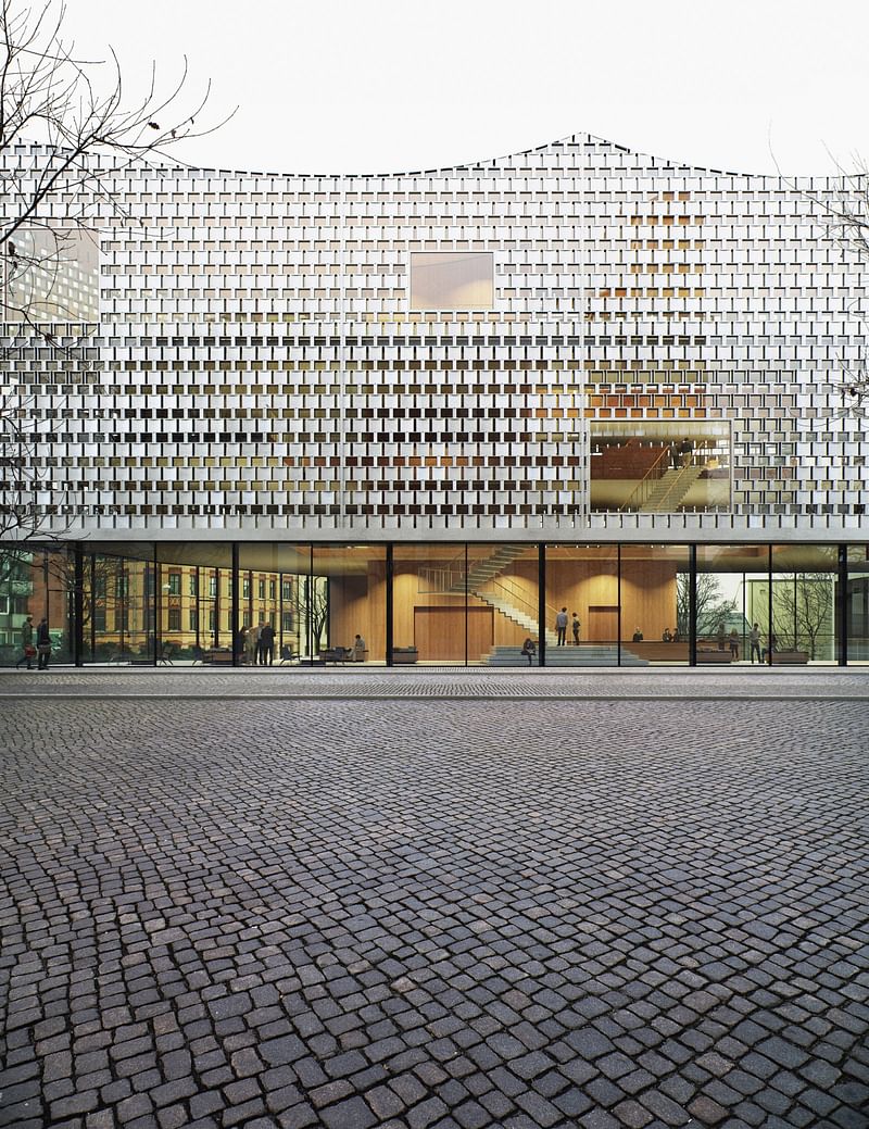
The competition jury praised the winning design as “an elegant interpretation of classical architecture” and for its “evident Karlskrona identity”.
Over the coming months, Dorte Mandrup's design will be further developed, and the project is expected to be complete by the end of 2021.
Find more project drawings in the gallery below.

RELATED NEWS Dorte Mandrup wins prestigious Träpriset prize for Råå Day Care Center

RELATED NEWS Dorte Mandrup Arkitekter to design Wadden Sea Centre in UNESCO heritage site


Share
3 Comments
Gary Garvin · Apr 06, 19 6:36 PM
+++
Involved yet graceful, with surprising subtlety. This should fit in well.
What are the three parts of baroque facade—base, body, capital?
Gary Garvin · Apr 06, 19 7:27 PM
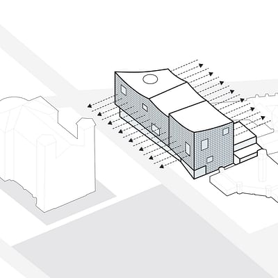
I think the point of the diagram (above, from the post) is that it shows how the large, clear rectangles of glass on the facade—interesting in themselves in how they vary the overall pattern—open up a view of and frame the older buildings surrounding.
The cultural center partially reveals itself, and will reveal itself in different ways depending on time of day and interior lighting, as well as engages the city and its cultural history. It is an exercise in, an active exchange of past and present, memory and perception.
And it doesn't overpower the other buildings, rather shows reserve in trying to complement and fit in, becoming part of a larger picture. The curving roof, that corner that curves up to an apex, towards some park or plaza, I assume, marking some focal point—what a design inspiration.
I do like this. One of the more engaging and original designs we've seen here.
Ayman Sabi · Apr 09, 19 1:31 PM
Very modern!
Comment as :