Announcing the Archinect UK Portfolio Competition 2017 results!
By Bustler Editors|
Thursday, Jul 27, 2017
Related
Earlier this year, Archinect UK (Bustler's sister site) launched its first ever annual UK Portfolio Competition, in celebration of the abundant talent of UK architects, interior architects, landscape and urban designers.
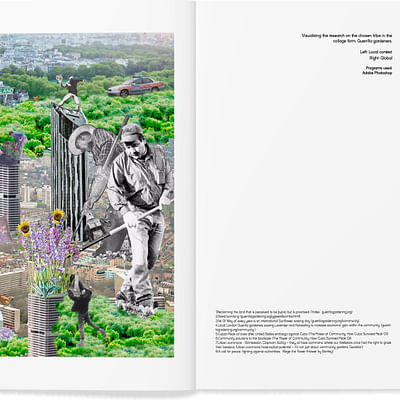
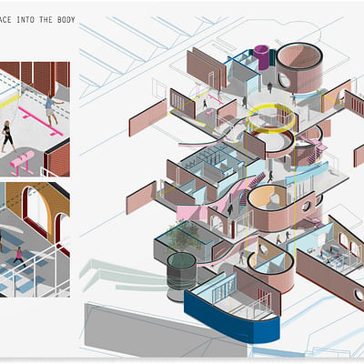
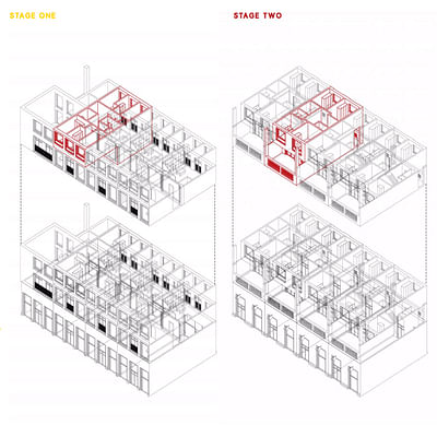
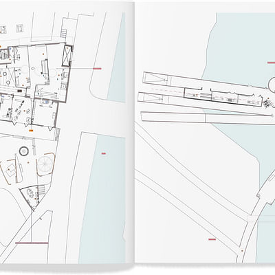
The first edition of the competition was a wonderful success. After receiving numerous impressive submissions from across the UK, Archinect and Bustler are thrilled to finally reveal the winners! Winners were publicly announced at an awards ceremony at the Interiors Educators Freerange show. Categories included “Best Overall Design”, “Most Creative”, “Best Use of Typography”, and more. Take a gander at them right below.
BEST OVERALL DESIGN

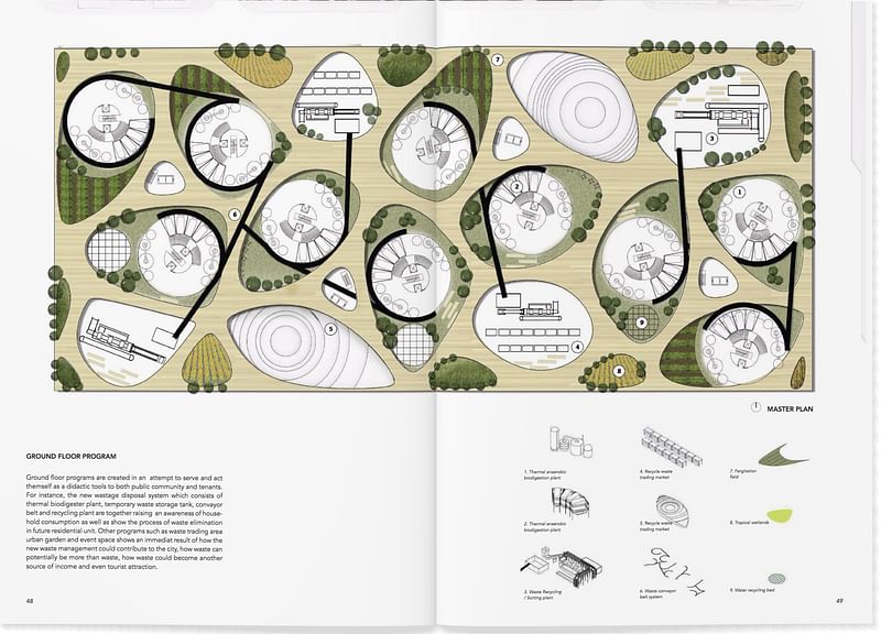
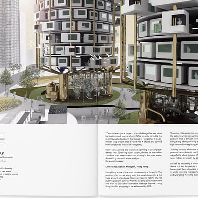
1st Place - Sirapa Supakalin
Judges said:
"Clear and easy to read with a consistent layout and visual style. "
"Very well presented portfolio of work that demonstrates a broad range of skills from architecture, to graphic and product design. Each project thoroughly described through the use of different drawing styles and media while at the same time in a consistent language. The inclusion of models and process photographs a good addition. Clear layout with full bleed images across both pages. The use of vignettes particularly effective in illustrating moments within the project. Original design ideas and particularly liked the 'Blow your glass of wine' project."
"Very nice variety of initiatives. Good understanding of place, and focus on nature. "
"Very clear and well-designed layout. It was easy to follow the progression of projects and was enjoyable to look through."
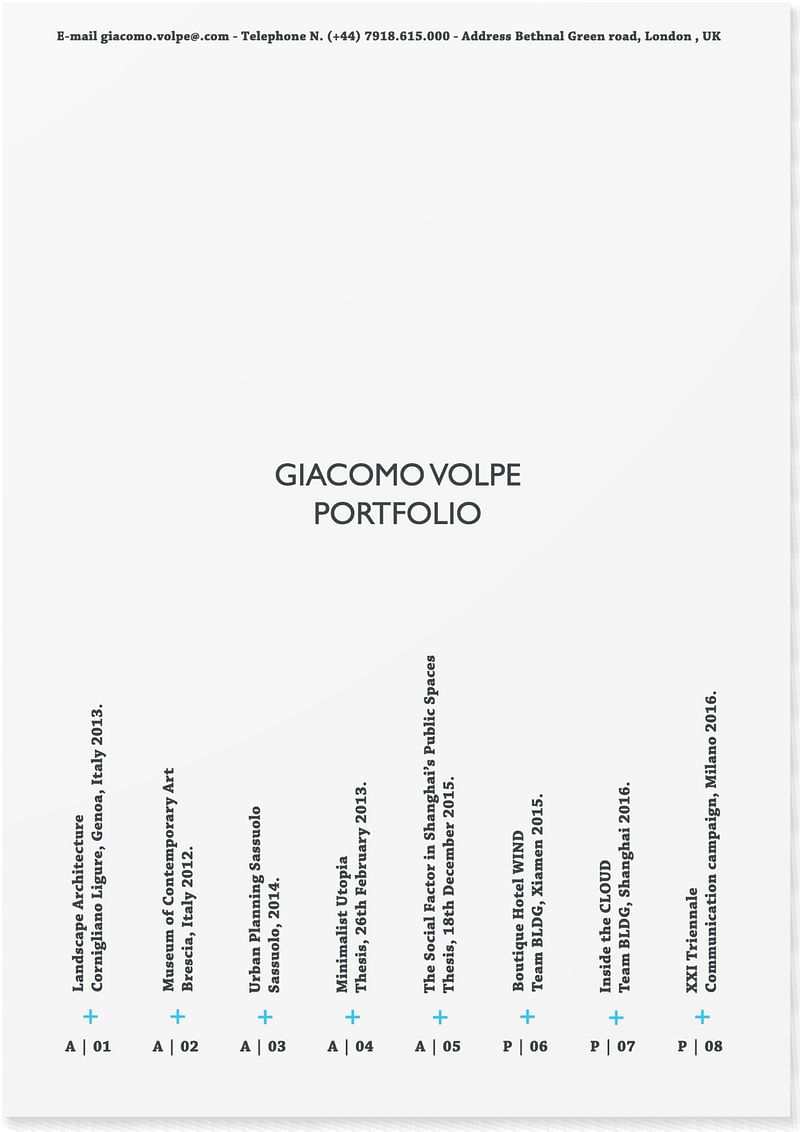
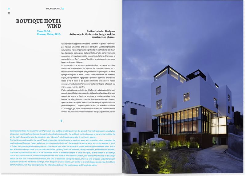
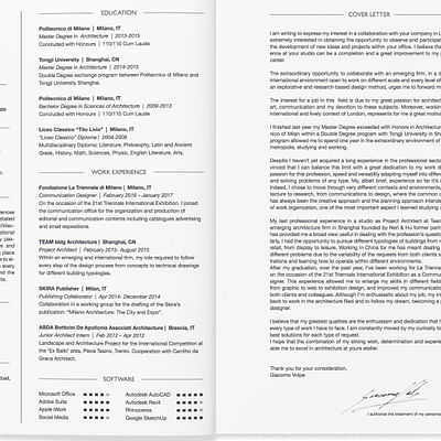
2nd Place - Giacomo Volpe
Judges feedback:
"Professional visuals with a clear concept. Good use of color."
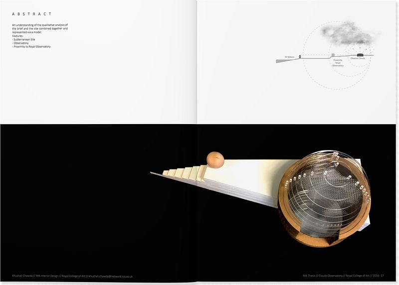
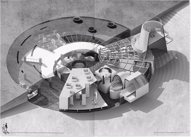
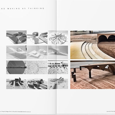
3rd Place - Khushali Chawda
BEST IMAGERY


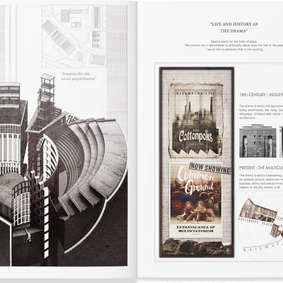
1st Place - Kwan To Tsoi
Judges Feedback:
"Good to see a consistent use of hand drawing and model making as a way to develop the proposals.
Particularly liked the Community Theater project that is described in great detail through a number of drawing studies that explore context and materiality for both the external expressions and the interiors, with reference to history and narrative."
"Made the project seem real and demonstrated real skill with explaining a concept with a wide variety of techniques. "
"Beautiful, atmospheric and sensual drawings with some really lovely view perspectives."
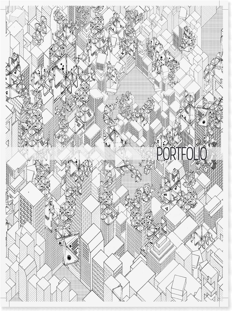
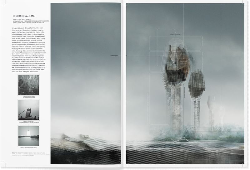
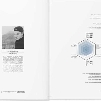
2nd Place - Luca Gamerini
Judges Feedback:
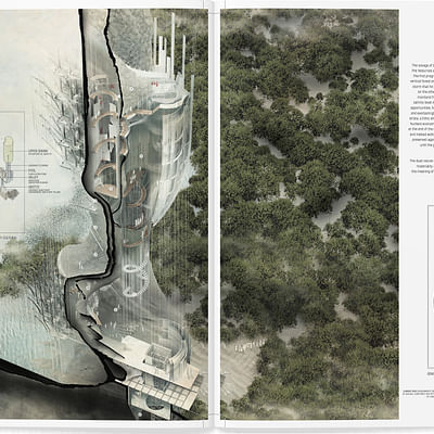
"Intricate, detailed images that are very intriguing."
"Bold, evocative. impressive level of detail."
"Intricate 3D drawings and renders successfully illustrate the spatial complexity of each project. Well presented alongside text and diagrams to clearly explain proposals."
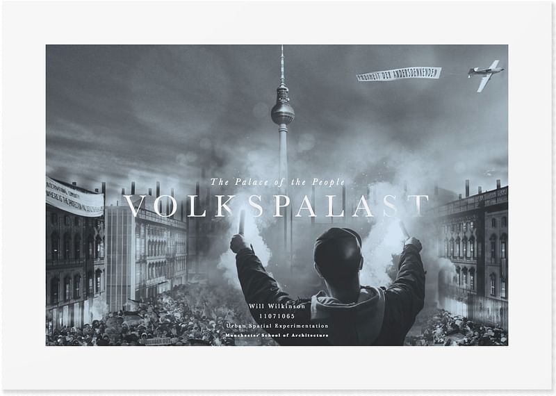
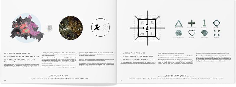
3rd Place - Will Wilkinson
Judges feedback:
"Very impressive imagery, that is imaginative and characterful."
BEST USE OF TYPOGRAPHY
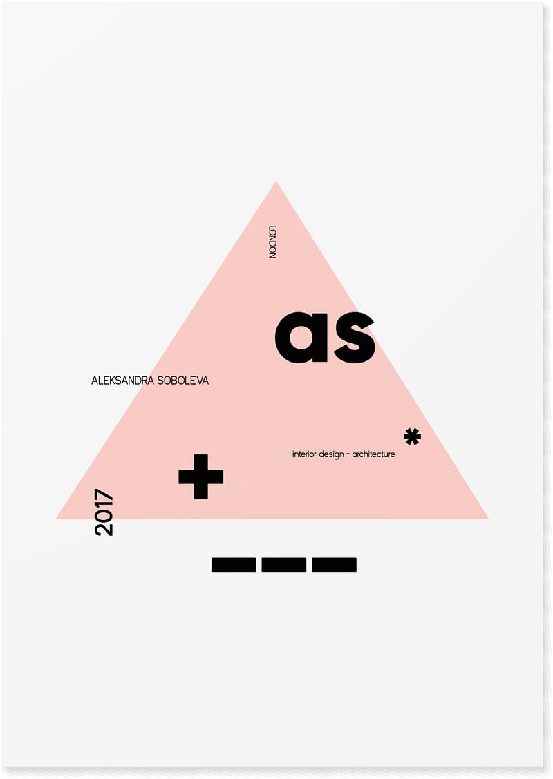
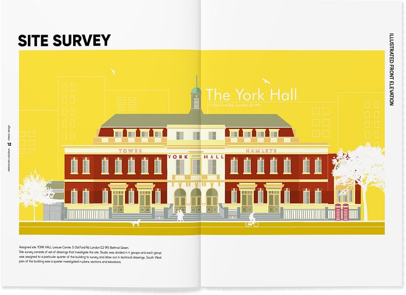
1st Place - Aleksandra Soboleva
Judges Feedback:
"Superbly elegant typography, creative and fun, clear and dynamic ."
"Strong directive clear text layout that suits the style of the portfolio and looks great. "
"Clear headers which make you feel like your know where you are in the document. Clean, attractive text that provides a guide without competing with the imagery. "
"Giving a title and subheading to each project creates a strong identity. Clear layout focusing on large format images - allowing enough white space is important as some portfolios can be too heavy in content."
"A fun and playful design with a bold typeface that invites you in further."
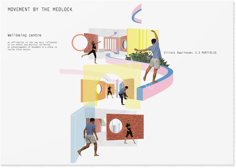
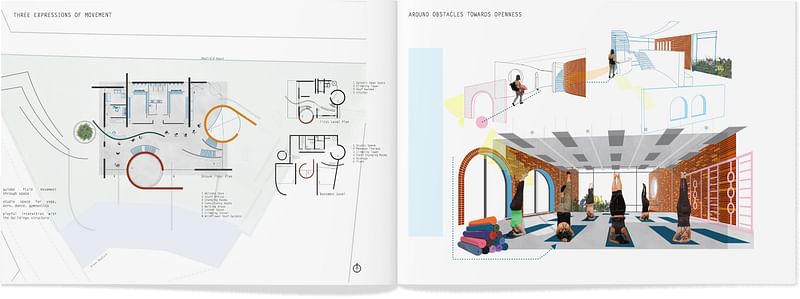
2nd Place - Elliot Rawlinson
"Very striking, well designed."
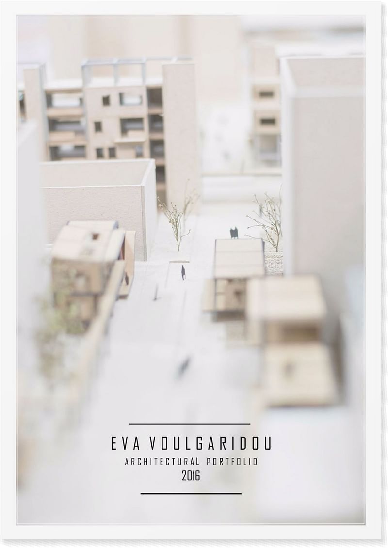
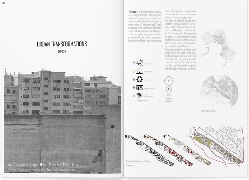
3rd Place - Eva Vougaridou
MOST CREATIVE
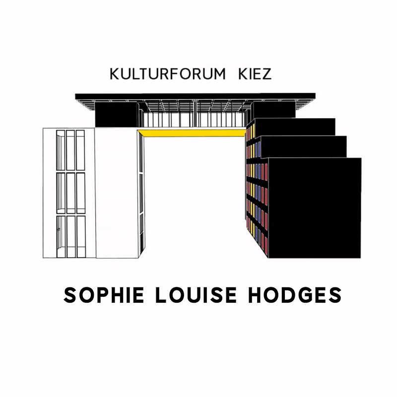
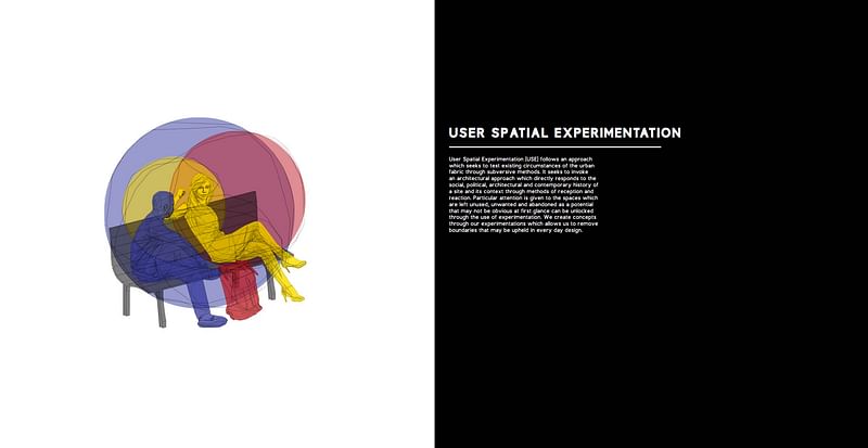
1st Place - Sophie Hodges
"Good to see a different format used and this square shape carried through in the drawings and imagery throughout. Good use of colors and a design style which provides a clear and easy to understand portfolio."
"Consistent theme; engaging use of colour; we liked the take on Mondrian theme."
"Very thorough research and grounding for the concept - has really thought outside the box. "
"Good use of design to curate content. The colour guide is particularly effective, it is clear and well planned and enjoyable to look through."

2nd Place - Aleksandra Soboleva
"Liked collage style shown in the work. Shows originality and playfulness which is important when communicating ideas. Projects are animated with inhabited sections showing life and movement. Strong use of color."
"Superbly creative, fresh, dynamic, interesting, really lovely!"
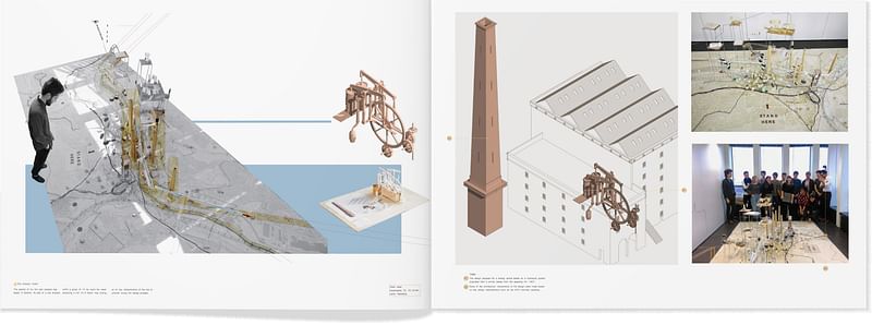
3rd Place - Peter Markos
"Nice to see different sizes and paper formats used in a creative way. A good mix of detail drawings, model photography, renders and diagrams."
"Great to see the inclusion of self initiated projects/competition work in a portfolio as these show an interest in design and creativity outside the academic and professional environment. Flair for hand drawing with some very nice sketches and illustrations."
JUDGES' FAVORITES
Aleksandra Soboleva - Julian Gitsham, Paul O'Brien and Laura Mark
"In a class of its own!"
"The chunky, bold text of this portfolio adds a fun and playful touch while making it clear and easy to understand. There is a nice balance between white space, amount of text and size of imagery which means you are not confronted with too much all at once. The colors and imagery portray the projects well and give a sense of delight."
"This portfolio stood out for its clear communication of ideas through the a range of drawings, collage, photographs and models that demonstrate a broad range of skills and originality. Liked the use of color and animation used in the images which bring the projects to life."
Kwan To Tsoi - Lindsay Urquhart
"Overall this is a very coherent well-designed portfolio that has a clear tone and style throughout."
Will Wilkinson - Will Sorrell
"A wonderful subversive concept which although tongue-in-check provides a practical solution for public action."
Luca Gamerini - Angela Hughes
"Very intriguing and make us stop to consider what was going on in each image; we felt that Luca was very expressive in his drawings; the cover was captivating; the length of the portfolio was just right. really good work."
BEST ARCHINECT PROFILE: Luca Gamerini
Find more of the winning projects in the image gallery below. Congratulations to all the winners! If you didn't enter the competition this time around, don't miss your chance next year!
Thank you to our sponsors:
Archireport – the building site management application for architects and project supervisors
Beswick Printing Solutions – who are offering 50% off on all printing – just quote ARCHINECT when ordering
Laurence King Publishers who are also offering 25% off all books just enter ARCHINECT (in capitals) into the discount box online.

RELATED NEWS Archinect UK Portfolio Competition: judges announced + deadline extended

Share
0 Comments
Comment as :