Winners of the “Architectural Competitions — as Institution and Process” giveaway
By Justine Testado|
Friday, Jun 9, 2017
Related
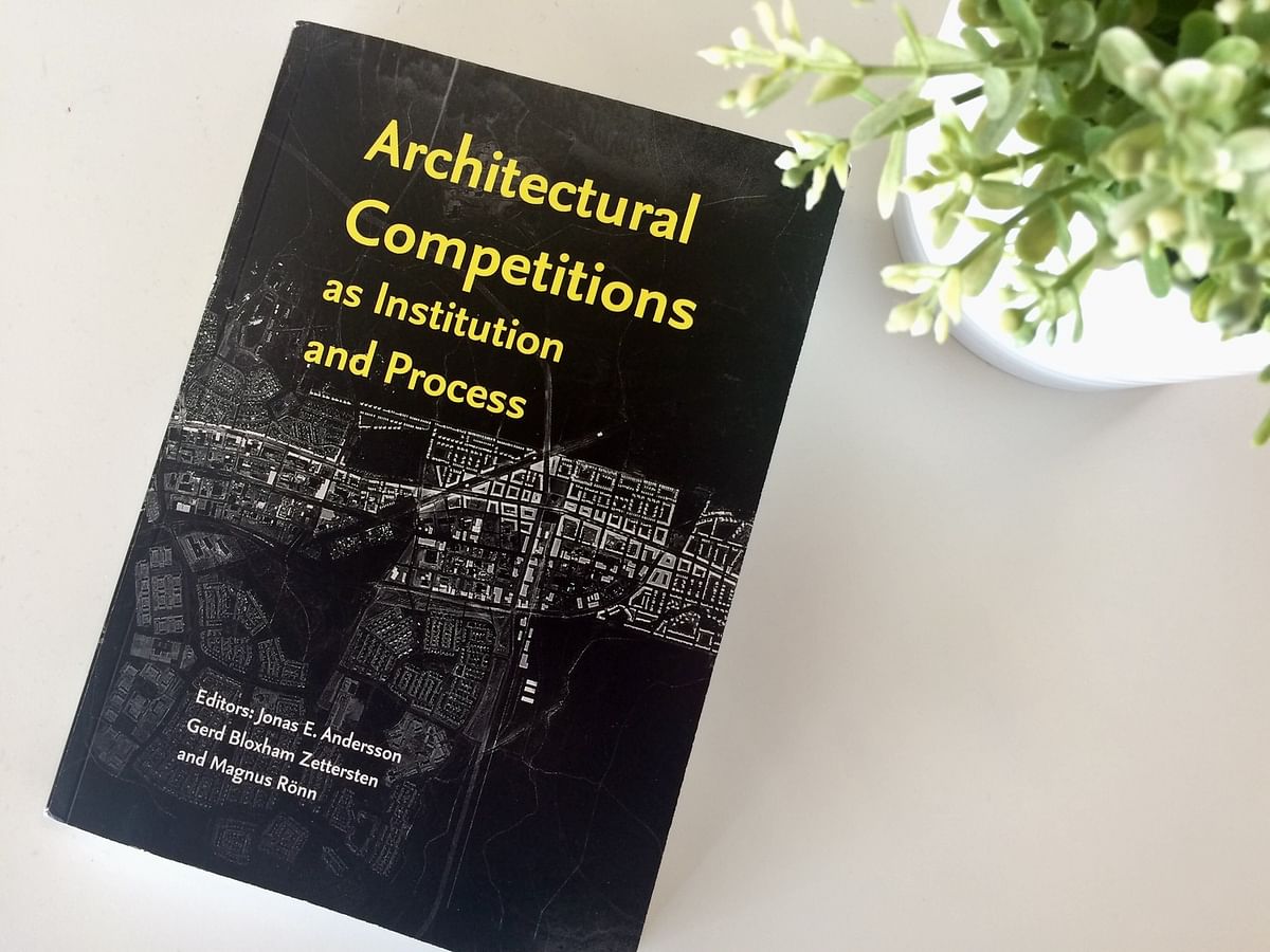
In Bustler's latest giveaway, our readers had the chance to win “Architectural Competitions — as Institution and Process”. Edited by Jonas E. Andersson, Gerd Gloxham Zettersten, and Magnus Ronn, the book is an informative 364-page anthology that examines the contemporary status of architectural competitions. For a chance to win, giveaway entrants were invited to share a non-winning competition entry.
Check out the giveaway winners' submissions below. Congrats to the winners!
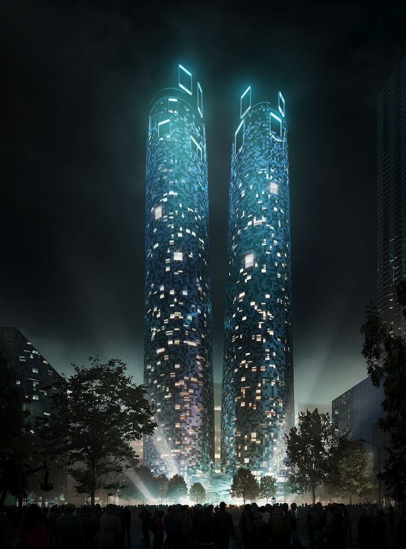
Project author: Mario Cucinella Architects Srl
Competition name: Parramatta Square, Stage 5 + 6 Architectural Design Excellence Competition
Location: Sydney, Australia
Year: 2013
Client: Paramatta City Council
Project description: “The two commercial towers Parramatta Square, were designed as a first step towards a new idea of the skyscraper. Firstly, we have addressed the issues related to the transparency and the relationship with the local climate. Too many buildings have already been built without taking into account the climatic conditions, at a price that is no longer sustainable for the environment. The towers are composed of a four-storeys retail podium, directly connected to the Parramatta Square and the train station. Just above this podium, a series of commercial floors for office use are located. At the top of the towers, we can instead find a series of spectacular terraces with panoramic cafes and restaurants.
The shape of the towers is quite simple but at the same time very iconic: two cones with an elliptic base turning into circles at the top of the buildings. The circular shape minimizes the ratio between the floor plane and the facades and, at the same time, avoids the presence of dark corners inside the building, while leaving the views open for the surrounding buildings. The pixel is the main aesthetic feature for the whole development and becomes the modular unit for the design of the whole complex. This module generates the entire building façade: first it shapes the big openings of the shops in the retail podium and then it turns into a regular grid in the central part of the towers, dedicated to the offices, finally it constitutes the big frames supporting the windmills on the top of the buildings.”
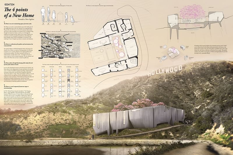
Project authors: Gary Polk, Jungjae Suh
Competition name: Hollywood - The Last House on Mulholland Competition
Project name: The 4 Points of a New Home
Date: Feb 10th, 2017
Project Description: “This project proposes a model residence that roots itself into the local scene of LA Hollywood while following the 4 Points of a New Home:
1. The Home is an actor maintaining agency of various scales.
2. The Home is a cultivation of its politics and environment, but transcends both.
3. The Home endures through the framing of the timely (hi-tech) by that of the timeless (lo-tech).
4. The Home is a vessel composed of numerous stages in intertwined play.”

RELATED NEWS Architects test the boundaries of L.A. residential design—beneath the Hollywood sign
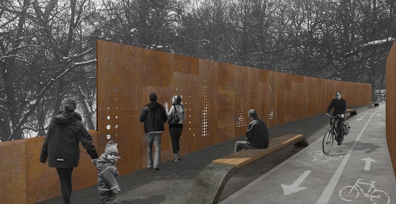
Project authors: Alina Sanina, Ustyna Antoniuk
Competition name: Design of public space commemorating Heavenly Hundred
Date / Location: 10.02.2017 / Ukraine. Lviv
“The Heavenly Hundred Memorial must do more than just a mark, it should force us to remember, to be proud of our Heroes and make a pledge to fighting for justice.
Task: save existed park and trees join two separate zones of the park for save transition design memorial space
Concept keywords:
FIRE - Corten steel 'corrosion resistance' and 'tensile strength'. This is a vivid material, resembles fire.
STONE - Simple and casual object, when suddenly has become an important defense tool.
UNITY - Bridge - symbolic element, that in turn join two zones.”
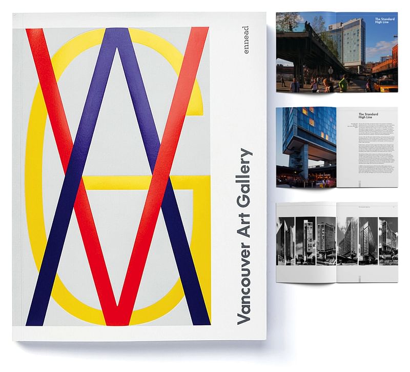
Creative Team: Aleks Dawson, Casey Estanislao, Todd Schliemann, Susan Strauss, Jeff Goldberg (Esto)
Competition name: Vancouver Art Gallery RFQ 2013 | 8.5x11”, 209pp.
Project description: “Ennead Architects responded to a request for qualifications to design a new home for the Vancouver Art Gallery. Ennead responded with an entirely bespoke piece far removed from the firm’s typical suite of marketing collateral. In November 2014 the print book won a ‘HOW Magazine In-House Merit Award’, and was published in their January 2015 issue.”

Share
0 Comments
Comment as :