24H Competition “Matrix” winners imagine the surreal possibilities of NYC's Times Square
By Justine Testado|
Friday, Aug 11, 2017

Related
The winners of the 24H Competition “Matrix” competition have been revealed! Created by Ideas Forward, the 24H Competition invites entrants around the world to put their skills to the test in a race against the clock. Once the prompt is revealed on competition day, they only have 24 hours to complete and submit their proposals.
Things got metaphysical in the 18th edition, “Matrix”. Inspired by the iconic film franchise, the competition challenged entrants to follow their instinct and draw out their own perceptions of reality — influenced by light, time, or space — in New York City's Times Square.
The competition concluded with three prize winners and seven honorable mentions.
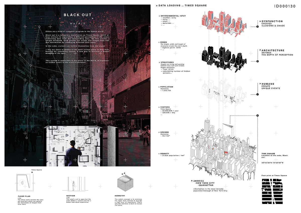
(cover image) 1st place: Arnaud Charoy; City: Aachen; Country: Germany
Jury comments:
“As a temporary installation, Blackout proposes a different perception of the Times Square with reference to the analysis of the surroundings. It also helps discovering hidden features of Manhattan and provides multiple and complex forms of perceptions. Superposition of the physical (real) and the digital (virtual) and the duality of crowd and isolation are appreciated.” — Heves Baseli
“The proposal has been properly conceptualizad in a clear and direct way. The graphic piece has got different visual resources, in one hand the sketches and in the other the image with different visual importance.The background picture containes tours by Times Square with elements linked to each other and information of the colective imaginary that estimulate the observer.The box outstands in the composition through its shape and color reinforcing the message of this new look of the place motivating the spectator to experiment the new perception of it.” — Sebastian Martinez
“A clear winner. Proposal was imaginative, well structured and clearly set out. The writing was intelligent, considered and informative. All presented beautifully with strong and compelling graphics, including 3D drawings, diagrams and rendered images.” — Alan Dunlop
“Analyzing the complex condition of Times Square, the design cleverly offers a very small intervention. Visualization of the data and narration of the proposal are also successful.” — Duygu Tuntas
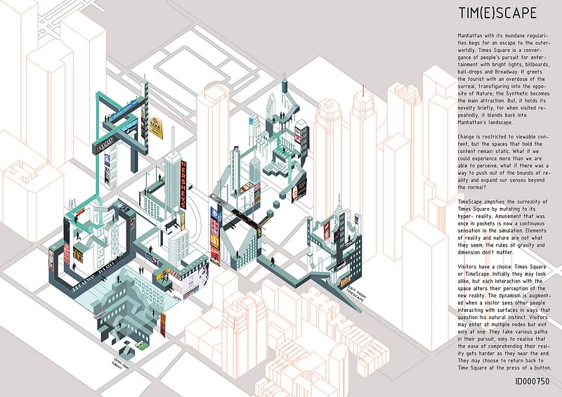
2nd place: Akshita Sabarwal, Aditi Vyas, Manushi Shah, Shreya Chheda, Ruta Mehta; City: Mumbai; Country: India

“Excellent submission. Strong graphic content with accompanying narrative that was clear and read well. Great use of colour, very legible and an attractive diagram. Thoughtful and provoking.” — Alan Dunlop
“A highly detailed drawing defines the proposal as an interesting take on the competition subject.” — Martin Wesley
“The graphic and narrated representation are very well fused. One reflects the other. The image transmits flow and dynamism, representing the multiple situations and perceptions that are experienced in Manhatann, almost surrealistic. An artificial stage represented with geometric forms, like a machine with layers that light up and others that are turned off activating diverse routes that give individual and collective identity.” — Sebastian Martinez
“By designing a fourth dimension, the proposal provides alternative event spaces as extensions to the real space. The design idea and the graphic quality deserve appreciation.” — Duygu Tuntas
“TimeScape provides an alternative reality for the Times Square. As a mutant form of the original Times Square, it makes infills to reality and triggers shifts of perception at specific points of interaction. The play with rules of gravity and notion of scale is appreciated.” — Heves Baseli
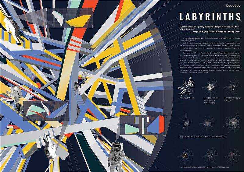
3rd place: Ruoting Wang, Ziling Yan; City: New York; Country: United States

“A burst of colour, which was immediately attractive and supported by clear narrative and text. Strong graphics and well structured submission, indicating both an architectural and artistic sensibility.” — Alan Dunlop
“An abstract submission with nice graphics and a good concept.” — Martin Wesley
“The narrative induces to reflection. The image impacts with its complex composition. Each piece of its components fusions despite the fact that it do not lose its individual characteristic.Intricate elements generate visual distortion that cause optical illusion which turns the decodification of the image became complex. Geometric shapes with bright colors into different directions produce optical illution of movements making random ways into several directions that reinforce the laberintic discourse.” — Sebastian Martinez
“The project proposes a series of altered individual experiences that are juxtaposed in the form of a labyrinth. It is conceptually coherent and the implementation of the idea on a concentric 3D space is inspiring. ” — Duygu Tuntas
“The idea of labyrinth as a space of possibilities and a platform of memories is the outstanding feature of the proposal. The labyrinth is full of options. It is endless and provides no escape. Therefore it provides a shift of perception at each junction. Perception is already a notion that is unique to an individual. It is not static but dynamic because it changes in time. In this sense the labyrinth as a metaphor for multiplicity and complexity of perceptions is appreciated.” — Heves Baseli
Don't forget about the honorable mentions in the gallery below!
Images courtesy of Ideas Forward.
RELATED COMPETITION 24h competition 18th edition - matrix

RELATED NEWS 24H Competition “Mythology” winners envision a temple for the Gods of Olympus

RELATED NEWS 24H Competition 16th ed. “raWar” winners rethink the war bunker

RELATED NEWS The winning “water village” entries of the 24H Competition 14th ed. “H2O”


Share
0 Comments
Comment as :