Steven Holl Architects wins competition for Tirana expo center and wine hotel
By Niall Patrick Walsh|
Monday, Apr 29, 2024
Related
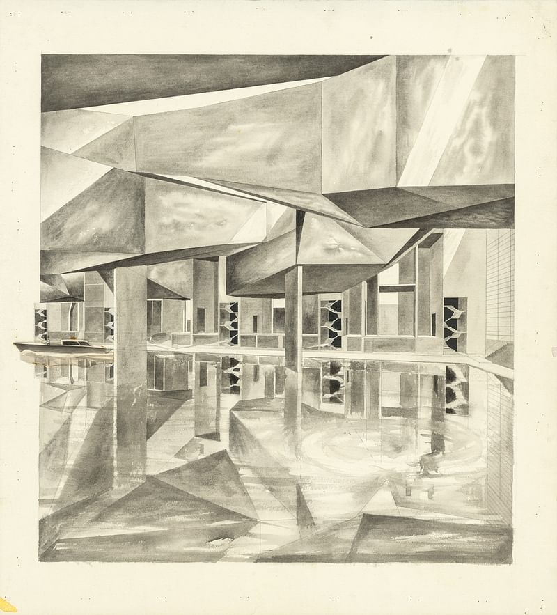
Steven Holl Architects has won an international competition for the design of a new expo center in Tirana, Albania. Titled ‘Expo Albania,’ the project will also see the construction of an adjacent wine hotel and demonstration vineyards with the potential for wine trade festivals to be held in the expo hall.
The scheme was designed in collaboration with artist Agnieszka Kurant, Atelier 4, Atelier Markgraph, Stoss, and Arup. Among the ecological considerations to inform the project were geothermal heating and cooling, and white solar shingles to help generate electricity. Skylights will provide natural light with the ability to be blackened for events, while a large reflecting pool of recycled rainwater and graywater will be integrated into the public space.
“Art drives the architecture of this new iconic center for Tirana,” the firm explains. “In collaboration with artist Agnieszka Kurant, this iteration of her 'End of Signature' will collect signatures from local Tirana communities and fuse them into a single wandering line. Traversing the rectangular volumes of the expo center, the line shapes the CLT roof trusses in a dancing rhythm.”
News of the scheme comes weeks after Steven Holl Architects celebrated its 50th anniversary, with Holl speaking exclusively to Archinect about the milestone. In February, meanwhile, the firm collaborated with SKUPINA on the Terezín Ghetto Museum in the Czech Republic.
Share
7 Comments
kjpn · Apr 29, 24 6:03 PM
weird
CC Chiang · Apr 29, 24 6:36 PM
Holl has moved from doing watercolors in bed to sending photos of random scribbles for his interns to turn to buildings
t a z · Apr 29, 24 9:11 PM
This extrude-o-matic style seems more like Zaha's wheelhouse, no?
t a z · Apr 29, 24 9:12 PM
Riverside Museum by Zaha Hadid Architects | Dezeen
alberto · Apr 29, 24 9:57 PM
Please publish images of the losers, no conspiracies, just curious
reallynotmyname · Apr 30, 24 7:24 PM
@alberto:
This Instagram account has several posts featuring the other entries:
https://www.instagram.com/akpt...
Gary Garvin · Apr 30, 24 7:28 PM
Agnieszka Kurant's "End of Signature" that influenced the design:
https://listart.mit.edu/art-artists/end-signature-2021-2022
To make The End of Signature, Agnieszka Kurant used artificial intelligence to create two different collective signatures realized as monumental light sculptures adorning the facades of two new buildings in Kendall Square.
Together they designed a neural network that was trained with a dataset of real signatures, which Kurant collected from scientists and other academics working in the building, as well as residents of the area. These individual signatures were then scanned and transformed by the algorithm into an “averaged” signature, which looks less like something signed by a human hand and more like an abstract, illegible scrawl that is trying to make sense of signatures that often lack clear alphabetical characters to begin with. As critic Christy Lange has written, “The hovering signatures in The End of Signature, similarly, make a kind of immaterial value visible—not only that of the artwork, but of the cognitive labor going on at MIT and the collective contributions of the wider community that supports it.”
The scribble, then, is an image of the collective identity of individuals, the image itself an individual and idiosyncratic expression. The work is interesting, certainly in the age of AI. Appreciating it, however, depends on this knowledge. Uniformed, however, we might take it as a symbol of loss of identity into collective noise, a meaningless scribble. At some point, the image has to speak for itself, regardless of intent.
How the scribble works for a whole building, however, may be another matter. I can't decide. It may hold meaning for locals, in the know, but it only works if we are told what's going on. And again, I wonder how this image might be received, again regardless of purpose. It's still a squiggly building.
There is a point to what Holl is doing, however. The design is not just groundless fancy, and I'm somewhat happy someone trying something out based on a set of ideas and perceptions. Cf. Mendelsohn's Einstein Tower, designed to reflect the physicist's theories.
Then there's the question of how long the image will hold up and sustain interest. Artwork can be taken down. A building remains a long time.
Comment as :